
 https://www.omahamediagroup.com/images/uploads/monster_gallery/Omaha-Media-Group-Black.jpg
admin
https://www.omahamediagroup.com/images/uploads/monster_gallery/Omaha-Media-Group-Black.jpg
admin
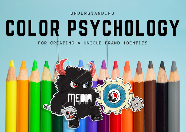
Believe it or not, humans rely on visual cues to make purchase decisions. Unless a brand uses colors in the right way, they cannot expect to get the attention of their customers, who are already barraged by a slew of advertisements. That is why it's important for brands to understand the term “color psychology” in its true sense.
Color psychology is an important research area that focuses on understanding the influence of colors on people's behavior and decision-making. When it comes to marketing, different colors can influence buyers in different ways. It determines how a buyer perceives a brand''s indentity when he or she notices specific hues.
A thorough understanding of color psychology can help marketers in creating a unique brand identity. Human minds are wired to respond to specific colors. As such, mastering the art of using the right colors can strongly position the brand in the minds of buyers. But for that, they need to understand which color represents what, and how to blend them to create a memorable brand identity.
In order to use the right color combinations in logos, posters, banners and ads, marketers should understand the significance of different colors. The following are a list of colors and how each color influences people:
Red is known to encourage appetite, which is why fast-food chains prefer to use it. It creates a sense of urgency and proves useful in clearance sales. Red is associated with excitement, movement and passion. The color is high in energy and draws immediate focus. Not only this, it stimulates the human body, raises heart rate and affects nerve impulses.
Blue is perhaps men's favorite color. The color represents reliability and peace. It provides buyers a sense of security and builds trust for the brand. But it is seen to increase productivity and lower appetite. It's the perfect color for corporate brands and offices. Young people tend to associate the color with maturity.
Green is associated with nature, tranquility and health. The color is also associated with wealthy people or brands. Most stores use green to create a relaxing atmosphere for customers. But it's the best color to gives a sense of harmony and encourage a balance between the body and emotions.
Purple is a color representing wisdom, royalty, and respect. The color is seen to stimulate areas of the brain responsible for problem-solving. This is why many anti-aging and beauty products use purple. The color shows a product or service as wise, creative and imaginative.
These two colors makes one optimistic and cheerful. It stimulates the logical center of the brain, and promotes enthusiasm. But it's surely helpful in drawing the attention of window shoppers and impulsive buyers.
Black represents power, authority, strength, intelligence and stability. The color is often used to trim down the appearance of sizes of items. But it can also overwhelm people when used too frequently.
White is associated with feelings of cleanliness, purity and safety. It can be used to represent the absence of any color or a neutral approach to marketing. But using white can give a sense of creativity because it's like a clean slate.
Grey is a symbol of timeliness, practicality, and solidarity. Using grey too frequently can evoke feelings of nothingness and emotions of depression, old-age and death.
Let us help you create a visually appealing brand! {contact-form}
We have a team of digital marketers who can help plan and bring to life all your digital marketing strategies. They can help with social media marketing, email marketing, and digital advertising!
CONTACT US


Comments