 https://www.omahamediagroup.com/images/uploads/monster_gallery/Omaha-Media-Group-Black.jpg
admin
Website Design and Functionalty Trends for 2015
Wow, how is 2015 almost already over? It seems like just yesterday we were ringing in the new year of web possibilities. A lot has come and gone in 2015 so in this article, we’ll boil down some of the most prominent web design trends emerging in 2015. It is here that we can find true innovation and new opportunities – a few of which may completely change our understanding of a “modern website”, at least for 2015 thus far.
When thinking about web design, you must consider the full spectrum of possibilities that the internet presents. Done boldly, designers can push the limits of human interaction and imagination on a global scale – as is often seen with edgier industries, such as creative agency websites.
Medium's visually inclined Jowita takes us through some of the most amazing visually enhanced trends this year, starting with Gesters.
1. Gestures are the new clicks
We forget how hard scrolling webpages used to be. Most users would painstakingly move their mouse to the right edge of the screen, to use something ancient called a ‘scrollbar’:

As a pro, you probably used a mouse wheel, cursor keys, or trackpad, but you were way ahead of most users.
In 2015 it’s far easier to scroll than it is to click. On mobile, you can scroll wildly with your thumb. To click on a precise target is actually more difficult — the complete opposite of what we’re used to on the desktop.
As a result, we should expect more and more websites to be built around scrolling first, and clicking second. And of course, that’s exactly what we’ve seen everywhere:
There’s every reason to expect this trend to continue as mobile takes over more of the market. Modern sites have fewer things to click, and much more scrolling. We’ll see fewer links, more buttons, bigger ‘clickable’ areas, and taller pages that expect to be scrolled.
Websites which spread their articles onto multiple pages will soon learn this lesson. Expect these to turn into longer single pages or even, like TIME magazine, into infinite scrolling pages:
It’s too early to know if the web will expand itself onto devices like watches, but if it ever does, you can bet it’ll be almost entirely driven by gestures.
2. The fold really is dead this time
Now scrolling is so cheap, and devices are so varied in size, ‘the fold’ is finally becoming irrelevant.
Designers are increasingly free to not cram everything at the top of a page. This leads to a design trend popularised by Medium — full-screen image titles, with no content visible until you start scrolling:
With tall, scrolling pages, designers have the chance to do what magazines have taken for granted for years: fill their pages with big beautiful images. In 2015 expect to see more designs that take up much more space — especially vertically — and a lot of larger imagery like this.
3. Users are quicker, websites are simplifying
Today every young adult is an expert web user. And even the amateurs are acting like pros: using multiple tabs, and swiping to go back a page.
The result is that everything is faster. And we’ve all learned to become impatient. If you want to make a mild mannered person explode with annoyance, just make their Internet really slow for a minute.
Now websites are forced not just to become faster (a technical problem), but to become faster to understand. Designs which slow the user down have the same impact on their audience as these websites which don’t load at all.
Simpler designs are easier to scan, which means they’re faster to appreciate. It’s easy to see which of these two designs is newer, and it’s because it’s the one that user’s can enjoy the fastest:

This is the biggest reason for the death of skeuomorphic design: users are more perceptive, less patient, and clutter only slows them down.
Apps put most websites to shame with super-minimal, beautiful interfaces. And they’re doing this because minimal interfaces perform better.
4. The pixel is dead
On a desktop, a pixel was a pixel. You even had an idea of how many pixels made up an average inch: 72 dpi. Nowadays very few people know what a pixel is.
With responsive design, we’ve seen a move towards grids and percentages. But one huge area remains still unchallenged: bitmap images.
Almost all of the web is built with images that have half the resolution of a modern display, and they don’t scale. With Retina displays and modern browsers, the time is right for vector images to become more popular in 2015.
We can see this trend already happening with the font-based icons andGoogle’s Material design. The website loads faster and scale the icons to any size without losing quality. That makes them ideal for designers and modern web browsers.

The technology exists now, but it will take time for professionals to change their habits to create for higher quality displays. Once the average desktop display becomes Retina-grade (like the new iMac), we expect designers to follow suit.
5. Animation is back
If you want to make a website look dated, cover it with animated “Under Construction” GIFs and Flash animation. But several things are coming together to make animation a rising star in modern web design.
Flat design can end up looking too consistent, boring even. Animation helps a website to stand out and to pack more information into less space.
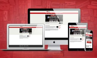
2015 has brought a lot of very cool visual enhancements, for the rest of the list please read 7 Future Web Design Trends by Jowita Ziobro at Medium.com below.
Do you have a favorite design trend? Share it below!
Hire the team to help you with your website, app, or other marketing needs.
We have a team of digital marketers who can help plan and bring to life all your digital marketing strategies. They can help with social media marketing, email marketing, and digital advertising!
CONTACT US

Comments