


 https://www.omahamediagroup.com/images/uploads/monster_gallery/Omaha-Media-Group-Black.jpg
admin
https://www.omahamediagroup.com/images/uploads/monster_gallery/Omaha-Media-Group-Black.jpg
admin
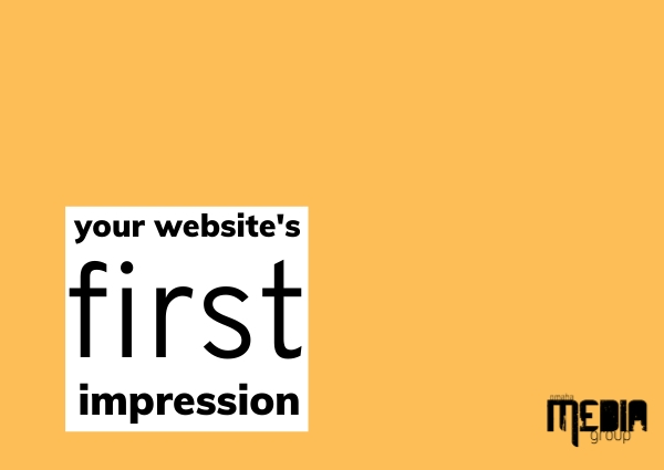
The first impression is everything. It is true, there is proven science behind that the first impression is everything, and this includes a website’s first impression. A consumer makes a judgement call and first impression about a company in less than one second. It is 50 milliseconds to be exact!
In other words, your website needs to instantly hit the mark and show consumers you are a trustworthy company. From the layout of the content to the navigation and even the colors chosen, all of this matters at the end of the day!
Poor design creates a feeling of mistrust in the company. Why does mistrust matters from consumers? Well, to be frank, this is because without customers it would be difficult to have a company to begin with. For a consumer to continue to purchase products and services and to be loyal to a company, they need to feel as if they can trust them and are being understood by the company.
A modern, responsive website is the best marketing strategy that a company can put in place. This is why our designers highlight some of the main points that are the very first impressions of a website.
Yup, even a font choice can dictate part of that first impression. Font psychology is the psychology behind a font for consumers. Their overall feelings, emotions and behaviors that come to fruition when they see this font. When Comic Sans is used in digital media versus a traditional Arial, it provokes different types of feelings! (We personally say to never use Comic Sans, but that is our personal font psychology and expert opinion.)
There is an ongoing joke within the design industry about Comic Sans. Our job, as graphic designers and web design specialists, is to assure your website never has a Comic Sans kind of reputation.
How do you determine the feeling your website conveys based on fonts?
If your company is contemporary, progressive or trendy, then you should consider using a modern font.
If your company is clean, professional or contemporary, then explore Sans Serif fonts.
This is Roboto Condensed which is part of the San Serif family, but provides a bold, in your face type of font!
Another great option!
What about sophisticated or elegant? Script fonts could be right up your alley.
Font is one of the most important factors in the design to make sure that your company’s branding is on point from the content to the voice of the font.
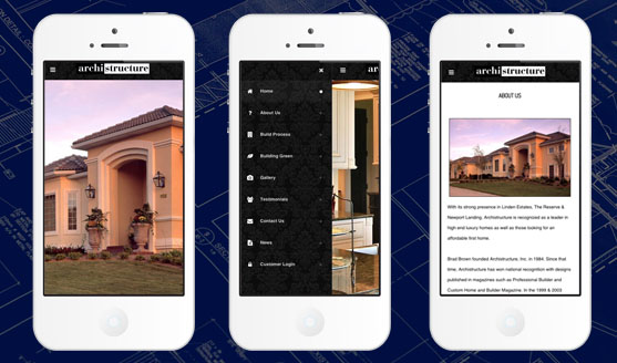
The reality of images on a website is that all images should be high quality professional images, and to be honest, skip the stock image as much as possible. This is more common than you think, for example,, a number of our clients when starting say, “we just googled some images and took those off the google search.”
Did you filter that search? If the answer is no, and if that image has copy-rights in place, that could be a very big problem. But, that is for another blog and another day.
Stock photos get a bad reputation in the graphic design industry because they can be expensive and be a bit weird. There are websites out there such as Canva, UnSplash and many others that provide some decent stock photography, but we have seen some concerning or weird pictures out there.
The reason why a company wants to have images of their employees, their office, different office layouts and their own personal stock is because consumers want to see people. It isn’t enough to just say you are a reputable company, consumers want to see the people in the reputable company!
At the same time, personalization has become an integral part of any marketing strategy and a company that uses and implements their own stock photography is going to appear more personal without even realizing it.
White space is the area between design elements. White space can be any color, texture, or background image, so long as it gives space.
Giving your website white space allows for balanced and more organized content, resulting in a better user experience. White space is not wasted space. In fact, we would consider it one of the most valuable parts of your design.
Knowing how quickly a user makes a first impression, white space creates content legibility, quicker interaction and removes visual clutter.
White space does not have to be “white.” It can be any color, pattern or shape behind that area, but this area helps to break up the text and provide a bit of a break.
Website design and developing a solid user experience is critical for a well designed website, and it is what we do best. Designing with trust and your first impressions in mind is a priority for us. When you are in the planning stages of your new website or fresh website design, we hope you will keep these notions in mind!
We have a team of digital marketers who can help plan and bring to life all your digital marketing strategies. They can help with social media marketing, email marketing, and digital advertising!
CONTACT US
Comments