 https://www.omahamediagroup.com/images/uploads/monster_gallery/Omaha-Media-Group-Black.jpg
admin
Get to Know the New Design for News Feed
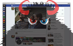
Yesterday Facebook announced a fresh, new look for News Feed on web, tablet and mobile. This design aims to make it easier for people to access the things they care about. For developers, this new design improves how the content appears in News Feed and how people can use bookmarks to reengage with apps.
In the new design, the things people share through apps are larger and more engaging in News Feed. Facebook is also making it easier for people to access their game and music feeds, now accessible from the top right area. To take advantage of this new design, we encourage you to optimize for high-resolution feed stories on both web and mobile by providing 600X600 pixel images (minimum 200X200 px).

Bookmarks are now more relevant for people and appear on every page. Bookmarks are an important way for people to reengage with apps, and we've made improvements so people can quickly access the games and apps they use the most. These ever-present bookmarks will also display the notification counter from the most recent game requests to help drive re-engagement with players.
We are beginning a slow rollout of this new design today. We will be testing and closely monitoring key metrics to optimize this experience for both users and developers.
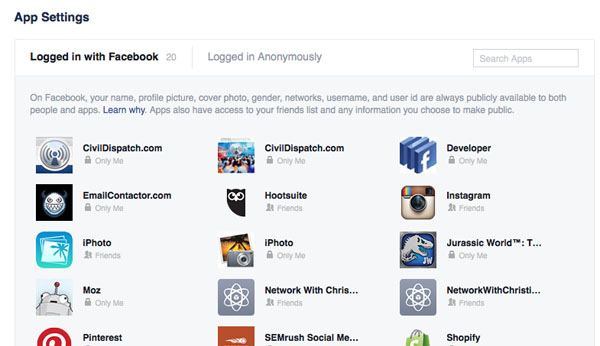
So what do you think? Like? Dislike?
Hire the team to help you with your website, app, or other marketing needs.
We have a team of digital marketers who can help plan and bring to life all your digital marketing strategies. They can help with social media marketing, email marketing, and digital advertising!
CONTACT US


Comments